Y&Y
Y&Y
Y&Y
Y&Y

The goal was to stop losing business clients to competitors by putting balances, payments and documents in one place, and moving document signing fully online.
Context
eParitet is one of the established commercial banks for business in Belarus, serving clients for over 30 years. The bank was actively acquiring new business customers but competitors started offering a noticeably better day-to-day experience, and clients began leaving.
The opportunity
The brief was open-ended on purpose: not "add feature X," but make the service itself good enough that it stops being a reason to churn.
My role
I led UX research and product design for the home screen and document-signing flow, working alongside an Art Director, a second UX/UI designer, a UX Researcher, a Product Manager, and a developer, end to end, from interviews through final desktop and Android screens.
The Problem
Balances were split across separate screens. Document status (pending, rejected, signed) wasn't visible without digging into a separate section. And anything legally binding still required a physical visit to a branch to sign. Every session repeated the same friction, for something that should take seconds.
If the home screen could surface everything a business owner actually needed, and signing could move entirely online, that alone could remove the biggest reason clients were unhappy.
Discovery
We identified two audience segments solo business owners who are the only "employee" of their business, and small/mid-sized business owners with an accountant and a team of 5–10 people and ran structured interviews with both, alongside a review of existing support data and a competitor analysis.
What came back was clear and, in places, surprising:
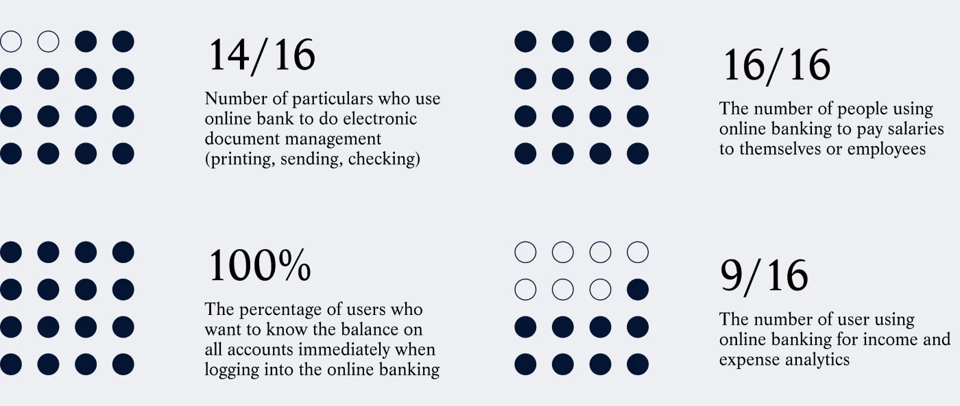
Three things stood out as worth solving first: surface all products on one screen (even when there are many), make document status visible without hunting for it, and let clients sign documents without visiting the bank.
One early direction borrowed the "stories" pattern from social apps a horizontal feed of cards for statuses, hints, and shortcuts, all mixed together. It felt familiar and engaging in concept. Testing it with real users told a different story:

We kept the card-feed pattern itself it was genuinely recognizable and easy to scan but stripped out the mixed content that made it confusing. That distinction mattered: familiarity is only useful if it doesn't come at the cost of clarity, especially for something as high-stakes as a legal document.
Final Solution
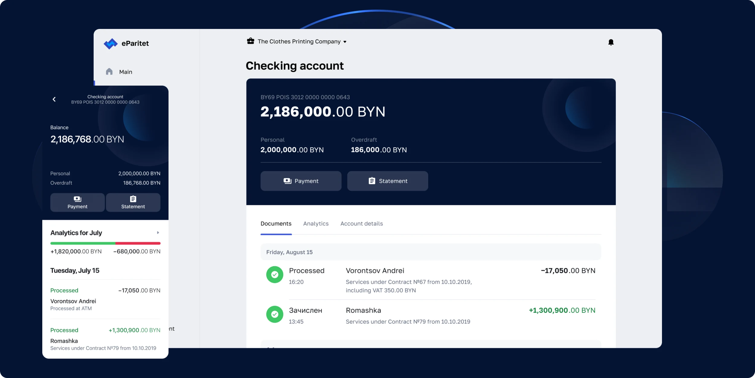
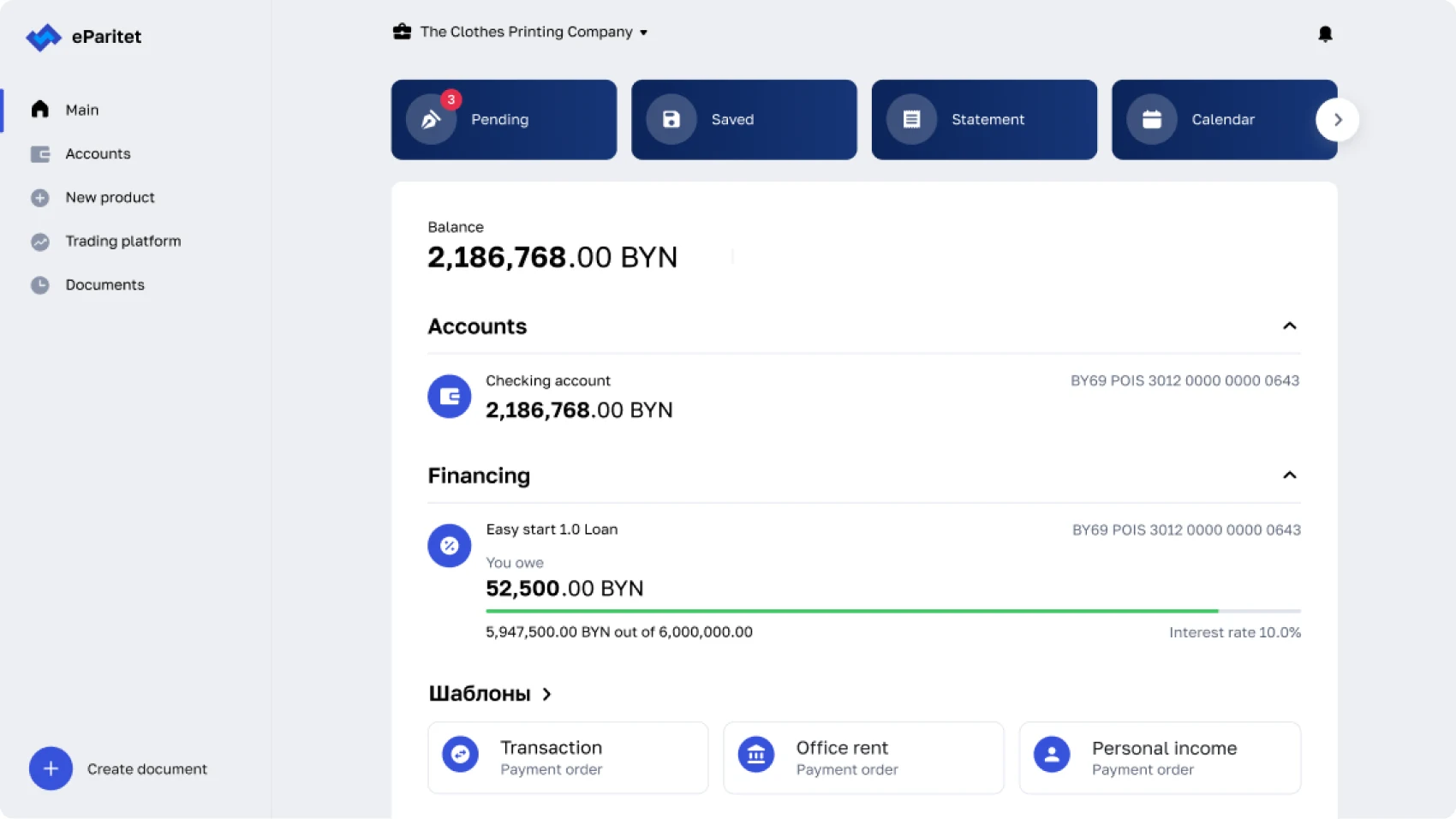
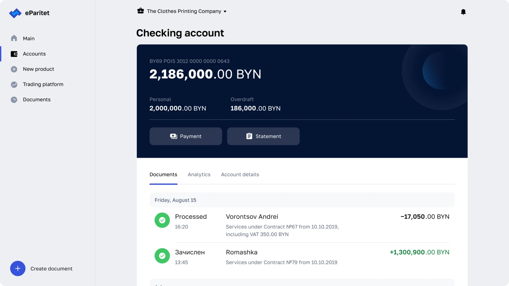
Clients see all their accounts (with the option to expand more), recent operations across every product in one feed, and document status, all without navigating away.
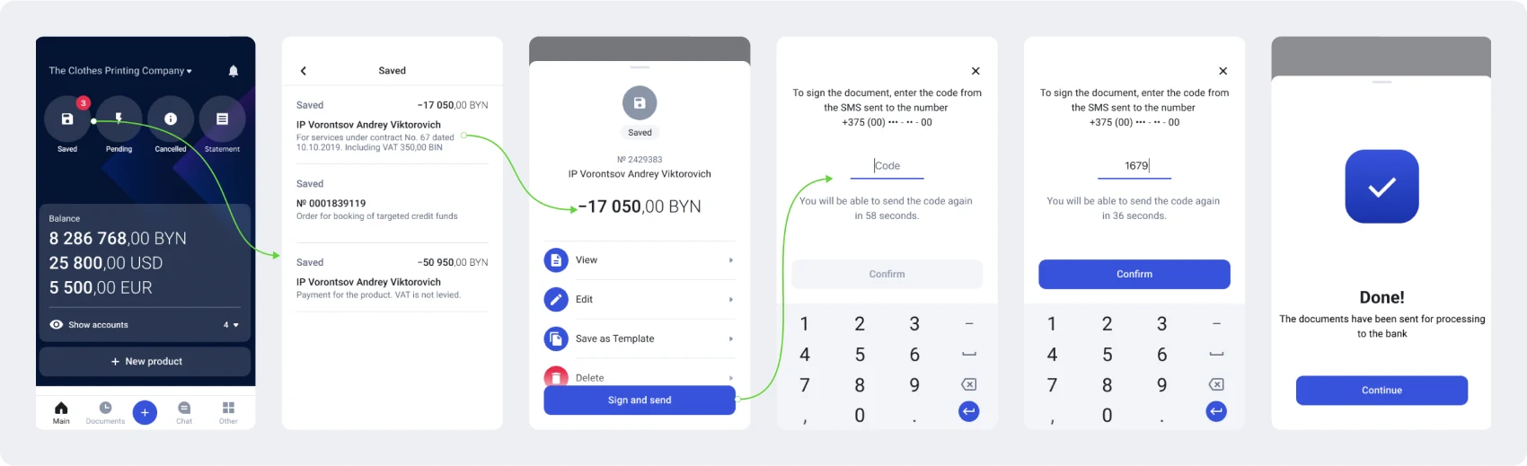
Save a document → review it → enter an SMS code → confirm → done. No branch visit required for something that used to demand one.
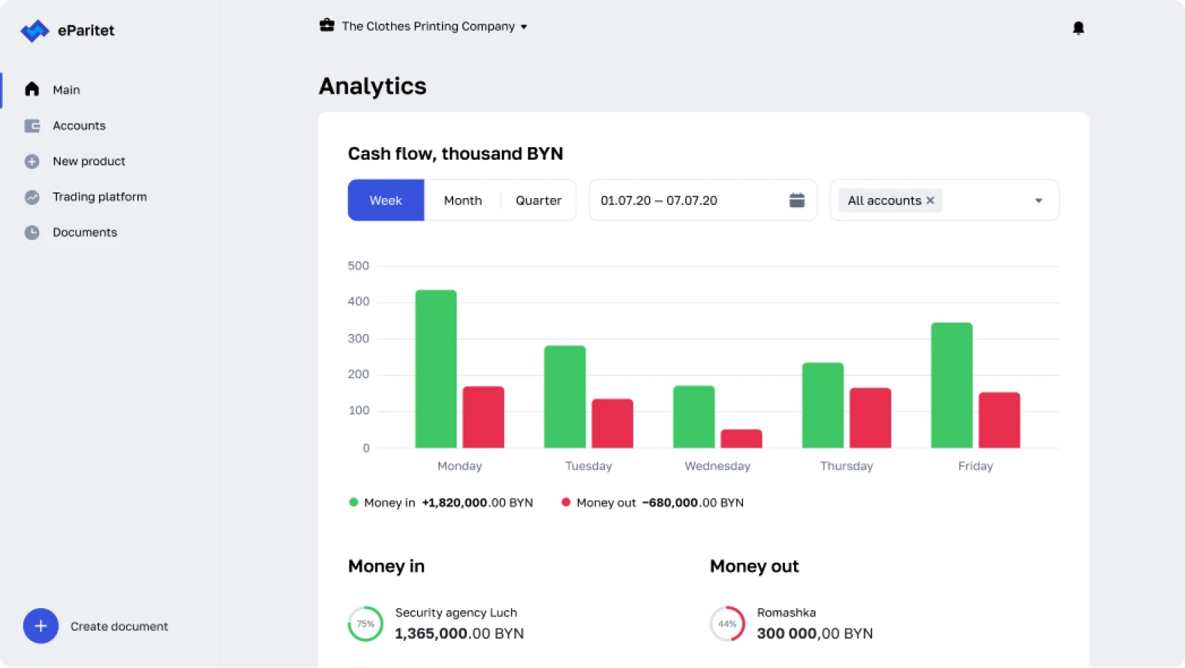
Income vs. expense, visualized on the home screen itself useful for the clients who weren't seeking out the separate analytics section but could still benefit from seeing it.
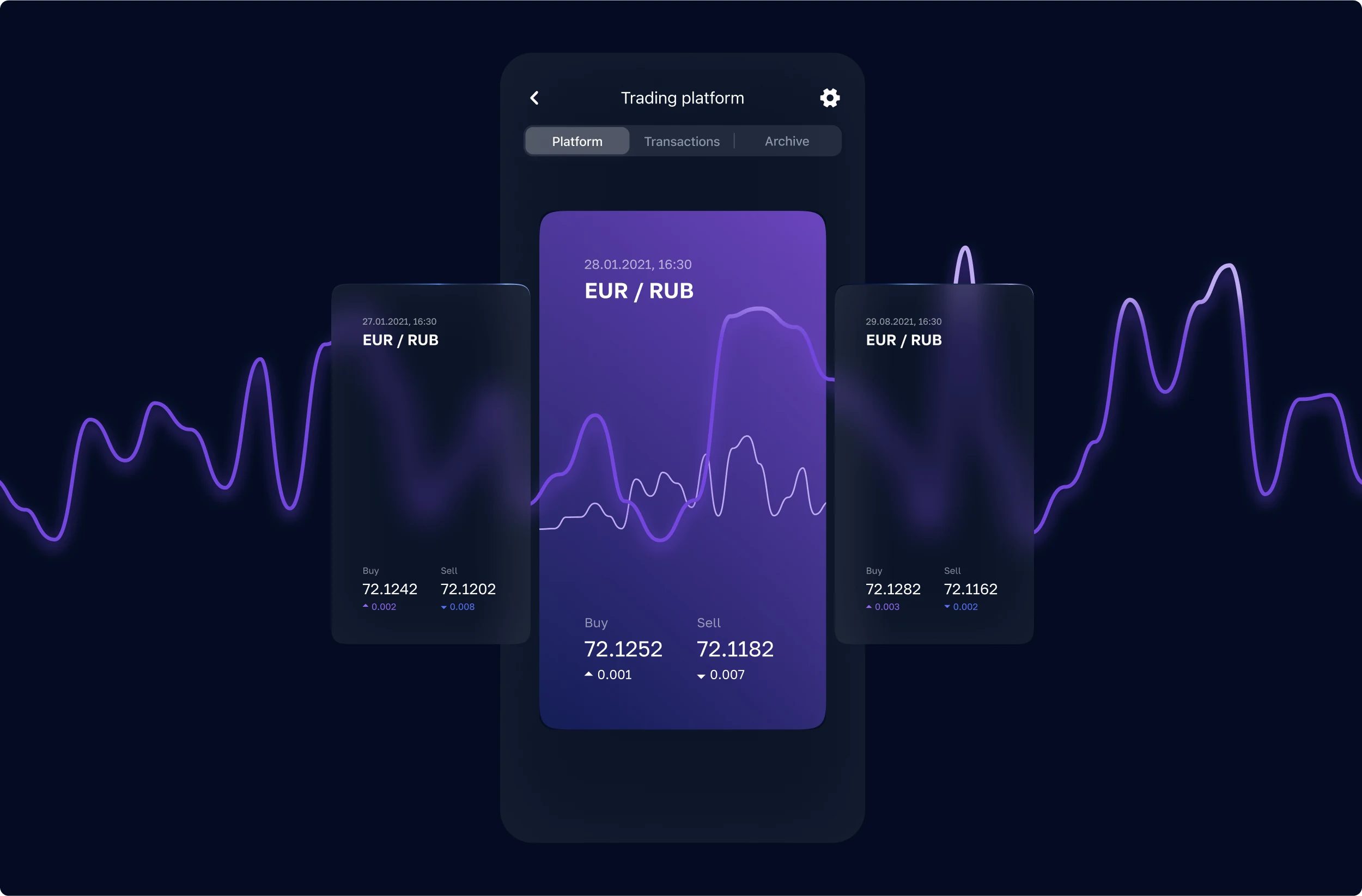
Clients are addressed by first name only, no patronymic. Balance actions are framed as choices "I want to top up" / "I want to withdraw" instead of neutral terms like "Deposit/Withdrawal."
Small, but it changes how the whole product feels to use.
Daily stand-ups and weekly demos kept design and implementation close throughout, with hands-on sessions to catch drift between shipped code and final designs before it reached QA.
Borrowing a pattern from consumer social apps for a banking context was the biggest bet in this project familiar, but potentially trivializing something that involves real money and legal signatures. We handled that by keeping the pattern for status and navigation only, and giving the actual signing flow its own linear, unambiguous sequence with no "social" framing at all.
The research itself was based on 16 structured interviews, enough to see strong, repeated patterns, but not a statistically representative sample of the full client base. We treated the findings as directional and validated the highest-risk decision (the card feed) with a second round of usability testing before committing engineering time to it.
First, I'd test the "stories" pattern on a larger sample before investing engineering time in it 16 interviews were enough to justify a prototype, but not enough to de-risk a decision this unconventional for a banking context before committing to build.
Second, I'd separate the research more clearly between the two segments instead of treating them as one group. Solo owners and businesses with a 5–10 person team have different pressures a solo owner is optimizing for speed and not thinking about banking at all, while a team owner needs visibility across more accounts and likely delegated approvals. Blending their feedback risked averaging away real differences in what each group actually needed from the home screen.